Friday, February 8, 2013
In Praise of the Still Life
I have to say a few words in praise good old fashioned still life painting.
Before returning to school to paint many of these, I had drawn a few and painted even less, but had enjoyed them at the time when I did do them.
As part of academic training, I wasn't sure how I was going to feel about doing so many of them.
I was used to seemingly more exciting subjects, and lots of free-form expression, and faces and figures etc.
So a part of me thought that it may become boring with a capitol B. Boring.
In the end, my appreciation for the still life has grown tremendously. I actually really love doing them--I have surprised myself with how much I enjoy them.
There is something about the "purity" and "simplicity" of a still life that makes it so appealing.
I use the words purity and simplicity more in terms of describing the "emotional weight" of a still life, not in the complexity or subject matter of the still life.
Being free of a human figure, or animal or another living thing--except perhaps a plant or something like that, the emotional or mental effect of only objects can be very calming and clearing in some way--as the subject simply is what it is...and the act of painting that can feel very centering and clearing. At least that has been my experience.
Not that a still life can't be imbued with a story or even an intended emotional charge---to make the effort to make one read that way can be interesting. Actually my still life series that I created for finals were still life paintings with a story.
Dutch Still Life
A study in the classroom studio with a traditional dutch still life palette. This is the first exercise in which we learned about glazing.
This is done on gessoed paper. I really like painting on this sort of surface.
We students broke up into two groups and each set up our own still life.
I was really pleased with this one--however it could be improved. The challenge of a limited palette can actually be an enjoyable one.
 Then there is this additional "Dutch-ish" study done at home in my studio. It Could use a bit more refining, but still a favorite. I especially enjoyed the glass dish and was pleased with how the metal scoop turned out. I glazed the glass bowl green later as it was originally more golden in keeping with more traditional dutch palette. The tabletop surface was an interesting challenge,due to the fact that it was awash with light, yet it was mostly dull surface.
The bowl was filled with quite a bit of light, and the apples almost appeared to float inside it.
Some of these paintings are a bit of a challenge to photograph, due to the gloss of the oils and for other reasons---they often look better in person.
Then there is this additional "Dutch-ish" study done at home in my studio. It Could use a bit more refining, but still a favorite. I especially enjoyed the glass dish and was pleased with how the metal scoop turned out. I glazed the glass bowl green later as it was originally more golden in keeping with more traditional dutch palette. The tabletop surface was an interesting challenge,due to the fact that it was awash with light, yet it was mostly dull surface.
The bowl was filled with quite a bit of light, and the apples almost appeared to float inside it.
Some of these paintings are a bit of a challenge to photograph, due to the gloss of the oils and for other reasons---they often look better in person.


Thursday, February 7, 2013
Giacometti and Diebenkorn
This was to have been painted in the style/influence of Alberto Giacometti.
I was pretty pleased with this one--I used what I liked from his work, but did not make it look exactly like his hand. I like his use of many lines to define form as I used here.
 This one was an assignment to either copy a painting by Giacometti, or do one in his style, and I chose to copy a painting. I was really intrigued by the original---the long lanky figures in an environment that is hard to define. I also like how it is divided into three spaces. I also chose it because I would never normally choose to paint something in this style. I really enjoyed this one.
 This next assignment was the same, but this time the artist was Richard Diebenkorn. I chose one of his early abstracts, as it really caught my eye---the layers of shapes, the layering of colors, some semi-transparent--also all the interesting shapes appealed to me. I really enjoyed this one as well. Breaking solid forms up into just colors and abstract shapes-very freeing and interesting.


Wednesday, February 6, 2013
Painting Exercises
In this one we were to use the biggest brushes possible throughout. It sort of has a blocky more "clunky" sort of look which I actually really like.
 These next two were painted in a Fauvist sort of style. All of the lightest tones were to be painted in yellow--the next darkest tones would all be in the redish-orange color and so on. I really love these!
It was a challenge to look for the same values and paint them all the same color--but it ended up being one of my favorite exercises with really interesting/exciting results.
These next two were painted in a Fauvist sort of style. All of the lightest tones were to be painted in yellow--the next darkest tones would all be in the redish-orange color and so on. I really love these!
It was a challenge to look for the same values and paint them all the same color--but it ended up being one of my favorite exercises with really interesting/exciting results.


In the (New) Beginning
These are the first couple of paintings done in the classroom studio.
The still life with the wine bottle was the 1st piece we painted. I really enjoy monochromatic color schemes.
I feel like my light source is actually better on this 1st piece than on the 2nd.
The second with the sculpted foot is similar but adds the use of white. This one could improve with a bit more contrast.
I'm really rediscovering how enjoyable painting a still life can be...
There are no figures to sort of imbue emotions with--just objects plain and simple. There is a certain "purity" in that which I have been surprised to find has been very refreshing!

 .
.


New Start
I have renamed my blog, as I am taking it in a new direction.
I will be focusing on my new journey in my career as I have returned to school to cut and facet my skills. I'm very excited about the process and have been enjoying the unfurling.
To set aside your ego as much as possible and approach an opportunity to grow in new ways...humbly, yet with the confidence of past experience, is a breath of fresh air, and mind-blowing...like stripping a building down to it's core foundations and starting all over.
It's about allowing. Allowing and not in resistance. There's excitement in knowing that anything can be possible.
I have had a great deal of experience in creating art in many different forms. But in the here and now...TODAY, to walk into a classroom...with a mindset that is open and fresh as if it were my first art class ever...is one of the most amazing and refreshing experiences I have ever had!
I have now been able to carry that mindset into my own studio as well.
There may be some pain in moving through territories that are uncharted--especially when your ego wants and demands some ideal of perfection. But sometimes the desire for perfection can kill the joy that is inherent in creating art and in growing in life. I realize now that it doesn't all have to be perfect...a little messy is real and acceptable, and beautiful in it's own way...and it doesn't have to be perfect to bring joy, happiness, and expansion.
I would now rather do it "messy" and be growing, than be doing it "perfect", and feel nothing for it.
Tuesday, June 15, 2010
Les Perruches by Jean Dupas
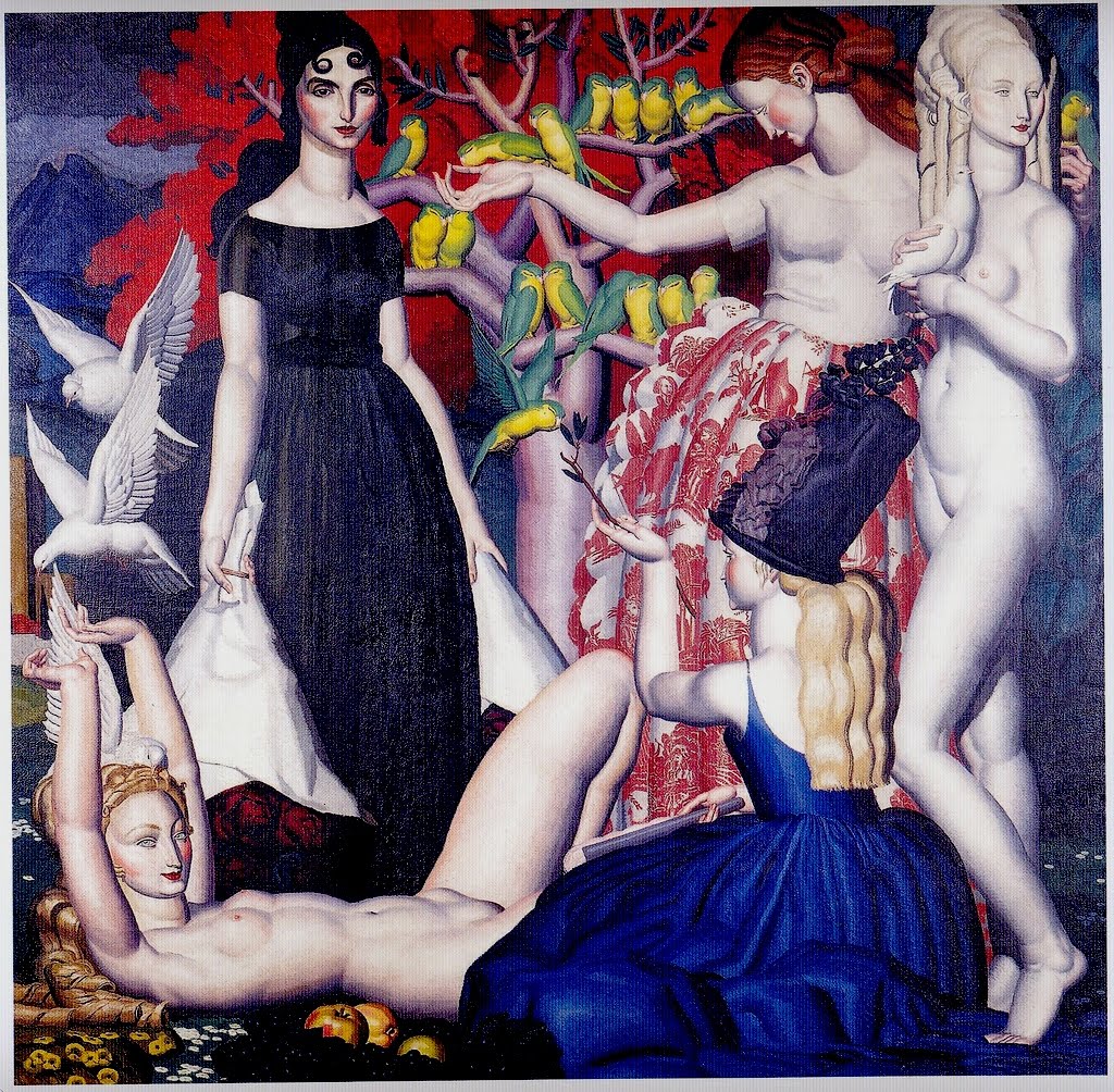

"Les Perruches" Perruches/Parrots, was painted in 1925 by Jean Dupas (1882-1964)
Some sources consider this a mural--whether "really" a mural or not that is what I will consider it to be here. It was created expressly to decorate a room in the Hotel/Pavilion d'u Collectionneur at the Paris Exhibition of Modern Decorative and Industrial Arts(what could be considered a world's fair of sorts) in Paris France in 1925. The famous Art Deco furniture designer Jacques-Emile Ruhlmann commissioned Dupas to design and execute a painting to decorate one of the rooms in the pavilion, and was originally located above a fireplace.
Dupas's work is certainly Deco in nature, however I feel that his work also has a Mannerist influence.I additionally feel that his work has a bit of a Surrealist, or perhaps Magic Realist feel to it. I think that his backgrounds/landscapes, and other elements in which his figures interact with at the very least have a lush dream-like quality to them. There is also a certain understated glamour to his images which is intriguing. These sort of elongated/Mannerist figures are something which you can see (to a greater or lesser degree) in some of the work of some other celebrated artists of the era, one of the best known being J.C. Leyendecker--is something that was not uncommon during this time, with some painting slightly "exaggerated" figures,and others painting with a fully exaggerated look.
Dupas also created other work in a more "realistic" vein. He worked quite often through his career as a muralist. This one is a favorite of mine--I supposed partially due to the organic lines throughout the piece--and a sculptural sense to the figures--and overall dream-like feel of the piece. I am also drawn to the bold use of color, specifically the yellow and green parrots set against the red leaves of the tree--amazingly vibrant and alive!
The doves(?) that are captured in mid-flight are also intriguing.For one thing they are obviously not parrots in a mural that is entitled "parrots". Secondly, Their positioning is really fascinating, in that they seem to be rising or descending from the reclining woman's head--like a thought descending or being sent...or perhaps both. Either way the effect is dream-like and spiritual.
Subscribe to:
Posts (Atom)