Wednesday, March 6, 2013

4 Paintings Part 4: "Sunflower"

This last one in the series is painted with layered imagery--showing a sunflower from three sides.
The sunflower that appears to be in the back is a sunflower viewed from behind, so you cannot see the seed head. Different parts of the flowers appear and disappear within each other.
I really wanted to imply movement---it's maybe something like a memory, where a clear cut perhaps more static image is assimilated, then creating a slightly more etheric sense of movement and energy.

Friday, March 1, 2013

4 Paintings Part 3: "Balance"

This was another painting with repeated imagery. In this one I really wanted to emphasize the negative spaces, and also really play with the push and pull of the darks and lights. I also chose to break up the lines here and there with a thin line or subtle smudge.
I was also very pleased with the shading of the figure and objects--and how they flatten out with the outlining.
This one is very interesting hanging different directions.
I would like to make four color prints and arrange them together on the wall in all four directions.

First, the way I painted it:


Sideways: Interestingly,sideways has a lot of implied movement.


Sideways this direction becomes almost totally abstracted:


Upside down: I think I like upside down as much as I like right right side up. Especially intriguing this direction.

Thursday, February 28, 2013

4 Paintings Part 2 "Cowboy"

With this one I made a more deliberate use of overlapping and repetition. I was also keenly aware of the negative shapes that were created with the figure--and the new interesting forms that were created by the overlapping and repetition.
This was also really fun--I would like to do more of these. I also am fascinated by looking at it all four different ways besides the way I painted it with the cowboys head at the top. Upside down makes for some really fascinating shapes, almost a waterfall sort of effect.
We turned the piece all different directions during our class critique.
The first photo is as I painted it:


On the side is interesting also--but I feel it may need it's mirror image for balance. It looks sort of like a reflection in water.


Other side:


And then upside down--sort of a waterfall feel, except flowing upwards :

Wednesday, February 27, 2013

4 Paintings Part 1 "Who Has Passed This Way Before?"

The next four paintings were all part of one assignment--making use of repetition, and overlapping images.
This first one was a narrative--the basic concept of this one is something like "Who has passed here before?"
I may go back in yet and refine some of the elements, but it was a fun piece. I do enjoy a narrative.
In Progress:


And finished:

Tuesday, February 26, 2013

Drawings

Some drawing assignments from Fundamental Drawing class.
This first one was done in class. Striped fabric wrapped around a metal easel. I really wanted to play with the push and pull of the darks and lights--between the objects and the background. I think I could have gone a bit darker with some areas, but I was still pleased with this one.


This one was to be rendered by the use of line only--no shading. I really liked all the deep tones of the green peppers--the dark tones would sort of facet--getting deeper and wider, then suddenly thinner and closer to the surface. I wanted to somehow portray these changes in tone, so I thought of curving lines recreating these shapes as much as possible. I was pleased with how they turned out.


Getting really good pictures of these drawings isn't very easy.

This one is a negative space drawing. You could only draw the space around an object. You look at the outside edge--at spaces between--spaces between objects (or the area/space around an object) that help make up the object. A fun drawing to do.


This was another fabric drawing--but you could not use shading--you could use thick and thin line only to show depth.

Wednesday, February 20, 2013

New Studies

I was determined to make some time to paint and experiment during Christmas break.
I made the time--and totally enjoyed the exploration!
Looking for images, I stumbled upon a pic of a beautiful Gandharan Buddha head.
I really became obsessed with the shapes that make up the head. (I think it is a fragment of a larger piece)
I wanted to try it in a few different styles:
This one is loosely based on the style of an artist named Ann Gale. I tried to make nothing but (mostly) horizontal brushstrokes to create the image.
I was pretty pleased with this--it needs a second layer worked over it to bring out the image more. I like how the image appears and disappears at different points into and back out of the background.


This next one was one in which I was interested in achieving a certain sense of immediacy to the painting. I also wanted to try to portray the energy of the piece. Attempting to portray the movement/feeling of energy that I can feel/see when I see/feel an object.

It's not all about seeing something...it's about feeling it.
And to feel it you have to see beyond what is immediately available to be seen,
and feel what it is made of from it's core moving back out to what is immediately seen.
I look at something until I feel it.
What's immediately on the outside isn't going to give you all the answers.
I have grown to be more interested in creating something imbued with feeling and energy, than in creating something that only fulfills some ideal of perfection. Although I still feel that there is nothing wrong with creating that bit of "perfect" when you desire to. This can be very fulfilling also.


For the next one, I was mostly really exploring the use of many lines to create form. I also chose a monochromatic color scheme which I really enjoy.
I really like the openness and linework. There is softness, yet also good line and solid form.


This one was a slight take on some of the work of Lyonel Feininger. I really wanted to capture his way of faceting the images and light. I would like to try this again, I think maybe with a different finish with the gessoed surface.
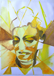


All four--I like to see them together. :)

Wednesday, February 13, 2013

Finals Painting Project

For our finals project we were assigned to create three paintings with something that tied all three paintings together.
It could be subject matter, or style, or an object---there were many possibilities.
Right away I thought of my wooden artist's mannequin, and once I got back to my studio I started coming up with ideas.
We were to take around 10 photos of each possible composition for each painting--when applicable.
So my original idea was to set up the mannequin in three different scenarios.
Originally, I was going to use a different scenario for each painting.
The first had an "In the Artist's Studio" theme:

Then a "Tea Break" sort of theme:

Thirdly, an "In the Garden" theme:

After reviewing the photos and going over the photos and concepts with the professor, she convince me of what I already knew, and that was the the Garden theme concept was the strongest, and would stand strong as a theme for all three paintings.
So the next step was to complete full size drawings of each of the three compositions that I decided upon. This was the first time we had performed this step as part of the process. So the drawing was 16x20, the same size as the canvases. It was interesting for me to see that the growth I was experiencing in painting had also improved my drawing skills.

The final paintings:

The Discovery.


The Embracing.


The Contemplation.


All three together:


All work assembled for critique.