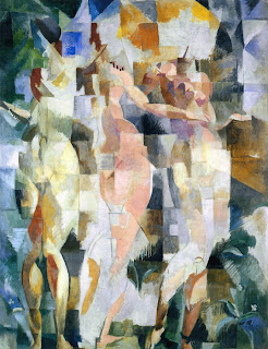
After discovering the work of Robert Delaunay earlier this Spring, I began to research more of his work. I discovered what appears to have been a study he did for a mural he painted for the Paris Exposition of 1937, entitled "The Three Graces".
Yes, I then became totally obsessed with this image. I put it on my desktop, printed photos of it, printed a couple copies of it, and even gave one to another artist friend, and spoke to my painting professor about it. I spent a good deal of time contemplating it, trying to understand it.
I love the sort of stained glass effect--or I might say, the way the colors facet light and dark, and how some areas are so filled with light that color is seemingly blanked out. At least that is how I see it.
I love this quote from Robert Delaunay, especially after just discovering Olivier Messiaen, and his thoughts on music and color, and revealing his experience of Synesthesia.
“These are based on studies in the transparency of color, whose similarity to musical notes drove me to discover the ‘movement of color’.”
The Delaunay original:
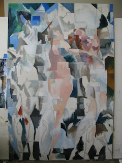
Some early stages:
The finished study.
It was an interesting journey. I have been thinking about trying to do a painting of my own in this style. It's difficult I think, to take a style like this and interpret something of your own in the same way--it's like a different language. But it isn't just about paint and brushstrokes, its also about energy, and feeling.
Thursday, August 1, 2013
Tuesday, July 30, 2013
Latest Backdrop
This latest backdrop was painted and designed earlier this month for All Shook Up. A pattern was chose for this backdrop rather than a scene, so I researched 50's fabric patterns as the show takes place in the 50's.
Finding some elements that I liked and doing some redesigning, I ended with this rough sketch:
After projecting the image with chalk, I then refine the sketch and redraw it with thinned down paint. As I was doing this I had to make adjustments to the placement of the elements of the design. I also made some changes in the pattern. This particular backdrop is the "grand oleo" and is approximately 16ft tall by 18ft wide.Next painting began.
My friend and fellow artist Brandon assisted me on the 2nd day. This was my first time having an assistant, and he had never painted a backdrop before, but he did a great job.
I don't get too many opportunities to use metallic paints on backdrops, but I used metallic gold here on the detailing. (Again following the designs of many fabrics of the era that used gold detailing)
I specially liked how in certain spots the gold is darker and in other areas it really shines and sparks.
Backdrop finished:
One of the additional pieces...called a ground row, also painted for the show.
Tuesday, June 11, 2013
Finals Painting
Completed for Painting 2 finals. 3ft x4ft.
I decided to do another painting that included overlapping imagery.
I had originally planned on painting a figure, but then decided on using the artist's mannequin again, due to the readily visible appeal of the geometric forms within it that I could play with.
First I took a series of photos of the mannequin in various poses to study the best ones

Then I did some sketches (several actually) these being two of the final ones.


Next I painted a small study:

Then work on the final piece began:


Reaching this stage, I began to feel a bit less inspired.

So I began to lay in shapes and lines that I felt within and around the forms. This was what inspired me initially about doing this painting. (besides the overlapping) As soon as I began laying these shapes and lines in I became inspired again! There was a great deal of inquiry in this piece--what's seen, what's not seen...what's darker, what's lighter etc.
And as it was finished:


I decided to do another painting that included overlapping imagery.
I had originally planned on painting a figure, but then decided on using the artist's mannequin again, due to the readily visible appeal of the geometric forms within it that I could play with.
First I took a series of photos of the mannequin in various poses to study the best ones

Then I did some sketches (several actually) these being two of the final ones.


Next I painted a small study:

Then work on the final piece began:


Reaching this stage, I began to feel a bit less inspired.

So I began to lay in shapes and lines that I felt within and around the forms. This was what inspired me initially about doing this painting. (besides the overlapping) As soon as I began laying these shapes and lines in I became inspired again! There was a great deal of inquiry in this piece--what's seen, what's not seen...what's darker, what's lighter etc.
And as it was finished:


Sunday, April 21, 2013
Backdrop
Earlier this month I designed and painted this backdrop for a local theatrical production of Enchanted April.
An Italian seaside landscape was the theme.
It's actually painted on the far back wall of the stage. The length is somewhere around 16ft. The tallest tree is somewhere around 12ft.
I made an effort to consider color harmony in painting this piece more than I usually would have, due to my training in my painting classes.
The initial sketch:

In it's beginning stages:

Painting progresses:

Completed:


An Italian seaside landscape was the theme.
It's actually painted on the far back wall of the stage. The length is somewhere around 16ft. The tallest tree is somewhere around 12ft.
I made an effort to consider color harmony in painting this piece more than I usually would have, due to my training in my painting classes.
The initial sketch:

In it's beginning stages:

Painting progresses:

Completed:


Thursday, April 18, 2013
Duality Painting
This painting assignment was a duality painting.
So one's subject or approach/technique would have within it opposites.
Such as:
cold/warm
dead/alive
smooth/rough
organic/geometric
dark/light
destruction/restoration
etc.
I was originally going to do a painting concerning life/death. So I began to collect images that would really juxtapose each other. Pictures of a cemetery, one of a baby, a building being torn down, a building being built and so on.
But as time went on it just wasn't feeling like the right approach--seeming almost trite--even though I had really wanted to do a painting with a more direct narrative--with a surrealist bent.
So it just wasn't working for me, so I decided to return to the hollyhock again and explore the dead/alive duality with the flower as the subject. I would say that it also has a bit of organic/geometric dark/light dualities within it as well.
So I began with rough sketches to figure out my compositional approach. I redrew the bottom half at least three times, before finally deciding to expand on the elements of the upper half of the painting that was already really working.
I included fresh new blooms in conjunction with dead blooms/branches, all from photos I had taken of the hollyhock I had in my backyard.
I'm fascinated how in it's short life span it grows like crazy--fiercely, heavy with pollen exploding heavy everywhere-then it begins to die off, but new growth begins even before the old is entirely gone. The base remains greenish even through the trials of winter, then bursts with life again as soon as the weather is just good enough to support it. Guess I see it rather symbolically. It accepts it's seasons completely and is nearly always in a state of renewal. I like that.
I chose to gesso a masonite panel approximately 2ft X 4ft as my surface.

Completed piece:

Overall there's a sort of collage feel to it, yet it almost feels a bit like one element. I chose the side view of the fresh blooms because I liked the triangular bell-like quality they have when seen from the side.
I also added the pollen as a last thought---after viewing some photos where the blooms had petals so heavy with pollen...with some pollen just tumbling onto other blooms. I was just sort of struck by how the pollen was symbolically representing life just pouring out and sputtering out in an overflow. The flower has no consciousness of it's life being a short one, and doesn't hold back it's passion for life. So along with some of the lines running from the petals, and the geometric form riding along the side of the bud, I feel that the pollen adds another level of movement to the piece.
So one's subject or approach/technique would have within it opposites.
Such as:
cold/warm
dead/alive
smooth/rough
organic/geometric
dark/light
destruction/restoration
etc.
I was originally going to do a painting concerning life/death. So I began to collect images that would really juxtapose each other. Pictures of a cemetery, one of a baby, a building being torn down, a building being built and so on.
But as time went on it just wasn't feeling like the right approach--seeming almost trite--even though I had really wanted to do a painting with a more direct narrative--with a surrealist bent.
So it just wasn't working for me, so I decided to return to the hollyhock again and explore the dead/alive duality with the flower as the subject. I would say that it also has a bit of organic/geometric dark/light dualities within it as well.
So I began with rough sketches to figure out my compositional approach. I redrew the bottom half at least three times, before finally deciding to expand on the elements of the upper half of the painting that was already really working.
I included fresh new blooms in conjunction with dead blooms/branches, all from photos I had taken of the hollyhock I had in my backyard.
I'm fascinated how in it's short life span it grows like crazy--fiercely, heavy with pollen exploding heavy everywhere-then it begins to die off, but new growth begins even before the old is entirely gone. The base remains greenish even through the trials of winter, then bursts with life again as soon as the weather is just good enough to support it. Guess I see it rather symbolically. It accepts it's seasons completely and is nearly always in a state of renewal. I like that.
I chose to gesso a masonite panel approximately 2ft X 4ft as my surface.

Completed piece:

Overall there's a sort of collage feel to it, yet it almost feels a bit like one element. I chose the side view of the fresh blooms because I liked the triangular bell-like quality they have when seen from the side.
I also added the pollen as a last thought---after viewing some photos where the blooms had petals so heavy with pollen...with some pollen just tumbling onto other blooms. I was just sort of struck by how the pollen was symbolically representing life just pouring out and sputtering out in an overflow. The flower has no consciousness of it's life being a short one, and doesn't hold back it's passion for life. So along with some of the lines running from the petals, and the geometric form riding along the side of the bud, I feel that the pollen adds another level of movement to the piece.
Wednesday, March 6, 2013
4 Paintings Part 4: "Sunflower"
This last one in the series is painted with layered imagery--showing a sunflower from three sides.
The sunflower that appears to be in the back is a sunflower viewed from behind, so you cannot see the seed head. Different parts of the flowers appear and disappear within each other.
I really wanted to imply movement---it's maybe something like a memory, where a clear cut perhaps more static image is assimilated, then creating a slightly more etheric sense of movement and energy.

Friday, March 1, 2013
4 Paintings Part 3: "Balance"
This was another painting with repeated imagery. In this one I really wanted to emphasize the negative spaces, and also really play with the push and pull of the darks and lights. I also chose to break up the lines here and there with a thin line or subtle smudge.
I was also very pleased with the shading of the figure and objects--and how they flatten out with the outlining.
This one is very interesting hanging different directions.
I would like to make four color prints and arrange them together on the wall in all four directions.
First, the way I painted it:

Sideways: Interestingly,sideways has a lot of implied movement.

Sideways this direction becomes almost totally abstracted:

Upside down: I think I like upside down as much as I like right right side up. Especially intriguing this direction.

I was also very pleased with the shading of the figure and objects--and how they flatten out with the outlining.
This one is very interesting hanging different directions.
I would like to make four color prints and arrange them together on the wall in all four directions.
First, the way I painted it:

Sideways: Interestingly,sideways has a lot of implied movement.

Sideways this direction becomes almost totally abstracted:

Upside down: I think I like upside down as much as I like right right side up. Especially intriguing this direction.

Thursday, February 28, 2013
4 Paintings Part 2 "Cowboy"
With this one I made a more deliberate use of overlapping and repetition. I was also keenly aware of the negative shapes that were created with the figure--and the new interesting forms that were created by the overlapping and repetition.
This was also really fun--I would like to do more of these. I also am fascinated by looking at it all four different ways besides the way I painted it with the cowboys head at the top. Upside down makes for some really fascinating shapes, almost a waterfall sort of effect.
We turned the piece all different directions during our class critique.
The first photo is as I painted it:

On the side is interesting also--but I feel it may need it's mirror image for balance. It looks sort of like a reflection in water.

Other side:

And then upside down--sort of a waterfall feel, except flowing upwards :

This was also really fun--I would like to do more of these. I also am fascinated by looking at it all four different ways besides the way I painted it with the cowboys head at the top. Upside down makes for some really fascinating shapes, almost a waterfall sort of effect.
We turned the piece all different directions during our class critique.
The first photo is as I painted it:

On the side is interesting also--but I feel it may need it's mirror image for balance. It looks sort of like a reflection in water.

Other side:

And then upside down--sort of a waterfall feel, except flowing upwards :

Wednesday, February 27, 2013
4 Paintings Part 1 "Who Has Passed This Way Before?"
The next four paintings were all part of one assignment--making use of repetition, and overlapping images.
This first one was a narrative--the basic concept of this one is something like "Who has passed here before?"
I may go back in yet and refine some of the elements, but it was a fun piece. I do enjoy a narrative.
In Progress:

And finished:

This first one was a narrative--the basic concept of this one is something like "Who has passed here before?"
I may go back in yet and refine some of the elements, but it was a fun piece. I do enjoy a narrative.
In Progress:

And finished:

Tuesday, February 26, 2013
Drawings
Some drawing assignments from Fundamental Drawing class.
This first one was done in class. Striped fabric wrapped around a metal easel. I really wanted to play with the push and pull of the darks and lights--between the objects and the background. I think I could have gone a bit darker with some areas, but I was still pleased with this one.

This one was to be rendered by the use of line only--no shading. I really liked all the deep tones of the green peppers--the dark tones would sort of facet--getting deeper and wider, then suddenly thinner and closer to the surface. I wanted to somehow portray these changes in tone, so I thought of curving lines recreating these shapes as much as possible. I was pleased with how they turned out.

Getting really good pictures of these drawings isn't very easy.
This one is a negative space drawing. You could only draw the space around an object. You look at the outside edge--at spaces between--spaces between objects (or the area/space around an object) that help make up the object. A fun drawing to do.

This was another fabric drawing--but you could not use shading--you could use thick and thin line only to show depth.

This first one was done in class. Striped fabric wrapped around a metal easel. I really wanted to play with the push and pull of the darks and lights--between the objects and the background. I think I could have gone a bit darker with some areas, but I was still pleased with this one.

This one was to be rendered by the use of line only--no shading. I really liked all the deep tones of the green peppers--the dark tones would sort of facet--getting deeper and wider, then suddenly thinner and closer to the surface. I wanted to somehow portray these changes in tone, so I thought of curving lines recreating these shapes as much as possible. I was pleased with how they turned out.

Getting really good pictures of these drawings isn't very easy.
This one is a negative space drawing. You could only draw the space around an object. You look at the outside edge--at spaces between--spaces between objects (or the area/space around an object) that help make up the object. A fun drawing to do.

This was another fabric drawing--but you could not use shading--you could use thick and thin line only to show depth.

Subscribe to:
Posts (Atom)


