Thursday, February 28, 2013

4 Paintings Part 2 "Cowboy"

With this one I made a more deliberate use of overlapping and repetition. I was also keenly aware of the negative shapes that were created with the figure--and the new interesting forms that were created by the overlapping and repetition.
This was also really fun--I would like to do more of these. I also am fascinated by looking at it all four different ways besides the way I painted it with the cowboys head at the top. Upside down makes for some really fascinating shapes, almost a waterfall sort of effect.
We turned the piece all different directions during our class critique.
The first photo is as I painted it:


On the side is interesting also--but I feel it may need it's mirror image for balance. It looks sort of like a reflection in water.


Other side:


And then upside down--sort of a waterfall feel, except flowing upwards :

Wednesday, February 27, 2013

4 Paintings Part 1 "Who Has Passed This Way Before?"

The next four paintings were all part of one assignment--making use of repetition, and overlapping images.
This first one was a narrative--the basic concept of this one is something like "Who has passed here before?"
I may go back in yet and refine some of the elements, but it was a fun piece. I do enjoy a narrative.
In Progress:


And finished:

Tuesday, February 26, 2013

Drawings

Some drawing assignments from Fundamental Drawing class.
This first one was done in class. Striped fabric wrapped around a metal easel. I really wanted to play with the push and pull of the darks and lights--between the objects and the background. I think I could have gone a bit darker with some areas, but I was still pleased with this one.


This one was to be rendered by the use of line only--no shading. I really liked all the deep tones of the green peppers--the dark tones would sort of facet--getting deeper and wider, then suddenly thinner and closer to the surface. I wanted to somehow portray these changes in tone, so I thought of curving lines recreating these shapes as much as possible. I was pleased with how they turned out.


Getting really good pictures of these drawings isn't very easy.

This one is a negative space drawing. You could only draw the space around an object. You look at the outside edge--at spaces between--spaces between objects (or the area/space around an object) that help make up the object. A fun drawing to do.


This was another fabric drawing--but you could not use shading--you could use thick and thin line only to show depth.

Wednesday, February 20, 2013

New Studies

I was determined to make some time to paint and experiment during Christmas break.
I made the time--and totally enjoyed the exploration!
Looking for images, I stumbled upon a pic of a beautiful Gandharan Buddha head.
I really became obsessed with the shapes that make up the head. (I think it is a fragment of a larger piece)
I wanted to try it in a few different styles:
This one is loosely based on the style of an artist named Ann Gale. I tried to make nothing but (mostly) horizontal brushstrokes to create the image.
I was pretty pleased with this--it needs a second layer worked over it to bring out the image more. I like how the image appears and disappears at different points into and back out of the background.


This next one was one in which I was interested in achieving a certain sense of immediacy to the painting. I also wanted to try to portray the energy of the piece. Attempting to portray the movement/feeling of energy that I can feel/see when I see/feel an object.

It's not all about seeing something...it's about feeling it.
And to feel it you have to see beyond what is immediately available to be seen,
and feel what it is made of from it's core moving back out to what is immediately seen.
I look at something until I feel it.
What's immediately on the outside isn't going to give you all the answers.
I have grown to be more interested in creating something imbued with feeling and energy, than in creating something that only fulfills some ideal of perfection. Although I still feel that there is nothing wrong with creating that bit of "perfect" when you desire to. This can be very fulfilling also.


For the next one, I was mostly really exploring the use of many lines to create form. I also chose a monochromatic color scheme which I really enjoy.
I really like the openness and linework. There is softness, yet also good line and solid form.


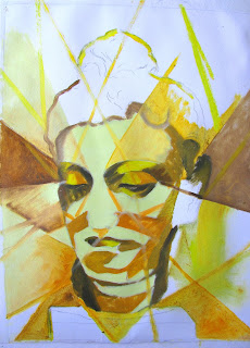
This one was a slight take on some of the work of Lyonel Feininger. I really wanted to capture his way of faceting the images and light. I would like to try this again, I think maybe with a different finish with the gessoed surface.


All four--I like to see them together. :)

Wednesday, February 13, 2013

Finals Painting Project

For our finals project we were assigned to create three paintings with something that tied all three paintings together.
It could be subject matter, or style, or an object---there were many possibilities.
Right away I thought of my wooden artist's mannequin, and once I got back to my studio I started coming up with ideas.
We were to take around 10 photos of each possible composition for each painting--when applicable.
So my original idea was to set up the mannequin in three different scenarios.
Originally, I was going to use a different scenario for each painting.
The first had an "In the Artist's Studio" theme:

Then a "Tea Break" sort of theme:

Thirdly, an "In the Garden" theme:

After reviewing the photos and going over the photos and concepts with the professor, she convince me of what I already knew, and that was the the Garden theme concept was the strongest, and would stand strong as a theme for all three paintings.
So the next step was to complete full size drawings of each of the three compositions that I decided upon. This was the first time we had performed this step as part of the process. So the drawing was 16x20, the same size as the canvases. It was interesting for me to see that the growth I was experiencing in painting had also improved my drawing skills.

The final paintings:

The Discovery.


The Embracing.


The Contemplation.


All three together:


All work assembled for critique.


Tuesday, February 12, 2013

Locust Pods

This was a study of locust pods (At least I'm pretty sure they are locust tree pods) that I discovered lying on the ground outside the Fine Arts Building last Fall.
I was really intrigued with their twisty shapes and dark tones.

Monday, February 11, 2013

Hollyhockin' with Venus

This was inspired by a small copy of the Venus Di Milo that I have, and dried Hollyhock branches--leftover vestiges of a monolithic hollyhock that had been growing in my back patio all spring and summer--and then began to renew and grow all over again at the end of summer into the fall, until the first really hard frost put an end to it's long glorious life. It towered over me, as at one point it was probably 8-9 ft tall.
I was kind of obsessed with it. Well...ok. I'm still obsessed with it.
Left behind from it's former glory were these equally cool dried/dead branches that carried curling orbs in different stages of unfurling, filled with seeds.
In some ways the dead branches are really as beautiful in this state as they were in life, but in a totally different way.
Also how interesting that the dead branches support these dried out pods...that carry all these seeds...and that within those seeds on that dead branch are all juicy stuff needed to create new life.
So inspired by the the crustiness of the branches and the smooth qualities of the venus, I put them together and painted this.
I suspect that I will revisit these subjects again, as this was a quick study.

Saturday, February 9, 2013

Color Still Life Paintings

This one was the first "full color" still life we did as a homework assignment. As a homework assignment, it may not be quite as polished as I would like but I think I achieved some nice things happening in this piece.This is one of my favorites. I was especially pleased with the color harmony in this one.
This piece was also a homework assignment. Again I can see room for a bit more refinement, but overall I was very happy with the results. I was especially pleased with the rocks--trying to capture their look--as they were in water inside the glass container.

Friday, February 8, 2013

In Praise of the Still Life

I have to say a few words in praise good old fashioned still life painting. Before returning to school to paint many of these, I had drawn a few and painted even less, but had enjoyed them at the time when I did do them. As part of academic training, I wasn't sure how I was going to feel about doing so many of them. I was used to seemingly more exciting subjects, and lots of free-form expression, and faces and figures etc. So a part of me thought that it may become boring with a capitol B. Boring. In the end, my appreciation for the still life has grown tremendously. I actually really love doing them--I have surprised myself with how much I enjoy them. There is something about the "purity" and "simplicity" of a still life that makes it so appealing. I use the words purity and simplicity more in terms of describing the "emotional weight" of a still life, not in the complexity or subject matter of the still life. Being free of a human figure, or animal or another living thing--except perhaps a plant or something like that, the emotional or mental effect of only objects can be very calming and clearing in some way--as the subject simply is what it is...and the act of painting that can feel very centering and clearing. At least that has been my experience. Not that a still life can't be imbued with a story or even an intended emotional charge---to make the effort to make one read that way can be interesting. Actually my still life series that I created for finals were still life paintings with a story.

Dutch Still Life

A study in the classroom studio with a traditional dutch still life palette. This is the first exercise in which we learned about glazing. This is done on gessoed paper. I really like painting on this sort of surface. We students broke up into two groups and each set up our own still life. I was really pleased with this one--however it could be improved. The challenge of a limited palette can actually be an enjoyable one.
Then there is this additional "Dutch-ish" study done at home in my studio. It Could use a bit more refining, but still a favorite. I especially enjoyed the glass dish and was pleased with how the metal scoop turned out. I glazed the glass bowl green later as it was originally more golden in keeping with more traditional dutch palette. The tabletop surface was an interesting challenge,due to the fact that it was awash with light, yet it was mostly dull surface. The bowl was filled with quite a bit of light, and the apples almost appeared to float inside it. Some of these paintings are a bit of a challenge to photograph, due to the gloss of the oils and for other reasons---they often look better in person.

Thursday, February 7, 2013

Giacometti and Diebenkorn

This was to have been painted in the style/influence of Alberto Giacometti. I was pretty pleased with this one--I used what I liked from his work, but did not make it look exactly like his hand. I like his use of many lines to define form as I used here.
This one was an assignment to either copy a painting by Giacometti, or do one in his style, and I chose to copy a painting. I was really intrigued by the original---the long lanky figures in an environment that is hard to define. I also like how it is divided into three spaces. I also chose it because I would never normally choose to paint something in this style. I really enjoyed this one.
This next assignment was the same, but this time the artist was Richard Diebenkorn. I chose one of his early abstracts, as it really caught my eye---the layers of shapes, the layering of colors, some semi-transparent--also all the interesting shapes appealed to me. I really enjoyed this one as well. Breaking solid forms up into just colors and abstract shapes-very freeing and interesting.

Wednesday, February 6, 2013

Painting Exercises

In this one we were to use the biggest brushes possible throughout. It sort of has a blocky more "clunky" sort of look which I actually really like.
These next two were painted in a Fauvist sort of style. All of the lightest tones were to be painted in yellow--the next darkest tones would all be in the redish-orange color and so on. I really love these! It was a challenge to look for the same values and paint them all the same color--but it ended up being one of my favorite exercises with really interesting/exciting results.

In the (New) Beginning

These are the first couple of paintings done in the classroom studio. The still life with the wine bottle was the 1st piece we painted. I really enjoy monochromatic color schemes. I feel like my light source is actually better on this 1st piece than on the 2nd. The second with the sculpted foot is similar but adds the use of white. This one could improve with a bit more contrast. I'm really rediscovering how enjoyable painting a still life can be... There are no figures to sort of imbue emotions with--just objects plain and simple. There is a certain "purity" in that which I have been surprised to find has been very refreshing!
.

New Start

I have renamed my blog, as I am taking it in a new direction. I will be focusing on my new journey in my career as I have returned to school to cut and facet my skills. I'm very excited about the process and have been enjoying the unfurling. To set aside your ego as much as possible and approach an opportunity to grow in new ways...humbly, yet with the confidence of past experience, is a breath of fresh air, and mind-blowing...like stripping a building down to it's core foundations and starting all over. It's about allowing. Allowing and not in resistance. There's excitement in knowing that anything can be possible. I have had a great deal of experience in creating art in many different forms. But in the here and now...TODAY, to walk into a classroom...with a mindset that is open and fresh as if it were my first art class ever...is one of the most amazing and refreshing experiences I have ever had! I have now been able to carry that mindset into my own studio as well. There may be some pain in moving through territories that are uncharted--especially when your ego wants and demands some ideal of perfection. But sometimes the desire for perfection can kill the joy that is inherent in creating art and in growing in life. I realize now that it doesn't all have to be perfect...a little messy is real and acceptable, and beautiful in it's own way...and it doesn't have to be perfect to bring joy, happiness, and expansion. I would now rather do it "messy" and be growing, than be doing it "perfect", and feel nothing for it.